
CREATING PHOTO-REALISTIC IMAGES IN 3D
Modeling and surfacing are the foundations of every photorealistic 3D image. Objects in reality have a great deal of subtle detail. Even the simplest object is complex in design and texture. Use links below to quickly jump to topics of interest.
Color
The first aspect of texturing is color! Although it is probably the most basic of the surface attributes that you will have to make when texturing something, it is by no means an easy one to produce. Nothing in real life has a constant perfect color. Any object has a color which is uneven in places, even if only slightly. The color map is usually the best one to start off with, when beginning to texture a new object, as it will give you an excellent starting point for the feel of the object. Be sure to add in loads of details for added realism - things like faded areas, scratches, smudges, blemishes, weathered marks - anything that makes it look like it exists in this world. Color maps are generally the only image maps that you will make that contain any actual color, as the other surface properties are best created in shades of grey.
Diffuse
Firstly, let me dispel a common misconception - diffusion is not color! Diffusion is the attribute of an object's surface that scatters light. It determines the actual amount of light that is reflected by the surface. In essence, it determines how much of the surface's color we'll see. By diffusing an object, you limit the amount of color that is reflected back by the light. This is completely different to simply darkening the surface of the object itself. If you were to darken the actual image used as a color map, you would see only see a change in color, but not a sense of color depth. Color depth is created by scattering light across an object's surface. The color isn't a simple continuous shade but rather many similar shades, created by scattered light. This quality can not be made by a color map alone, as a color map cannot give a surface the richness that a diffuse map can. Obviously, having said that, Diffuse and Color go hand in hand. Diffusion also works very closely in conjunction with Reflection, which I will discuss in a moment.
Luminosity
This attribute determines whether or not an object has any self-illumination properties, and how strong they are. This is only used for things like florescent lights, light bulbs, LED displays, electronic billboards, lava, molten metal, and so on. A luminosity map works best in conjunction with radiosity, so that the luminous value can become translated during the render process as a source of light, and will thus illuminate objects around it slightly. Bear in mind that your settings have to be rather high for this effect to work best.
Specularity
It is a shame that Specularity, an extremely important aspect of a surface, is all too often overlooked. In fact, I would say that color and Specularity are the two most useful basic surface attributes in determing the initial look and feel of your surface. The specularity of an object determines how shiny it is and how light is broken up by it's surface. Now, keeping in mind what I said earlier about being aware of how people and weather interact with and affect a surface, you make use of a specular image to show how the world has "made it's mark" on the object, so to speak. Things like smudges from a cloth, fingerprints, wetness, polishing, etc will all play a part in determining what goes into the main specular image. Specularity works most closely with three other surface properties - Glossiness, Bump and Reflection.
Glossiness
Specularity in conjunction with Glossiness determines how spread out or how tight an area the light's "hotspot" becomes when it come into contact with the surface. An object with only a small difference between the specularity amount and the glossiness amount have a very small "hotspot", therefore they appear plastic-like; whereas an object with a large difference between the two will spread the light out over a much wider area, therefore appearing more dull, like metal (except chrome-plated metal, of course). The moment you add any specular amount to a surface, the Glossiness option becomes activated, and you adjust this setting in order to get the right balance of shininess.
Reflection
Another pretty self explanatory property, reflection determines how reflective an object is and in what areas it is reflective. As previously mentioned in the paragraph on specularity, the reflection map should vary along the surface according to how it has been interacted with. This attribute is sadly often overused - a huge giveaway that an object is CG is often due to the fact that the texture artist has made it too reflective. That is not to say that reflectivity is not a common property - in fact, most things which are in any way shiny, are slightly reflective too. Although reflectivity is not to be confused with the effect that radiosity has on objects, where the surface of one object can pick up small traces of the color surrounding it due to bounced light. You should attempt to create this effect with reflection, as your surfaces will just end up looking wrong.
Transparency and Refraction
Transparency is not Opacity. It is, in fact, the opposite. Transparency determines how "see-through" an object is (whereas Opacity determines how opaque it is. An object which is 0% percent opaque will generally disappear out of a scene, whereas an object with 100% transparency will just be completely see-through, yet still visible). Obviously, things like glass, Perspex, liquids, crystal, etc have varying degrees of transparency.
Transparency is also affected quite a bit by the specularity of an object - especially in the case of oily fingerprints left on a surface - obviously these areas are not going to be as transparent as the surrounding areas that have not been touched.
Transparency has a special relationship with Reflection, called the Fresnel Effect. This effect is basically the variation of transparency according to the angle at which you view it. An example of this is if you see a lake from a far off distance, it appears very reflective, yet the closer to come to it, the more transparent it appears. This effect of becoming less reflective and more transparent increases as the angle at which you see it increases.
Most substances which are transparent, refract light. Refraction is the bending of light through transparent bodies. This causes the effect of, for instance, if you have a scene with a glass of water in it, when you look at objects through the glass of water the objects you see are warped. Different substances have different refraction amounts, and a table of these amounts can be obtained almost anywhere - however, the higher the refraction amount, the more light is bent as it travels through it. Refraction amounts in reality do not exceed 2.0.
Translucency
Translucency is the ability for an object to be backlit without being transparent. Take for instance, a curtain - when a light is shone through it, you can see things moving behind it, even though it is not transparent. In reality, just about everything, with the exception of metal and wood, has some degree of translucency. This property can be extremely useful for skin, in particular, so that if a bright light is shone onto it, you can catch a glimpse of the veins which run just below the surface. Translucency works best when combined with a calculation called Sub Surface Scattering, which is a property that basically allows light to enter the surface of an object, bounce around inside the surface, and then leave it at a different angle to that in which it entered. Translucency and Sub Surface Scattering are extremely important, especially for surfaces such as skin and fabric, where they should always be used.
Bump
The most commonly-used attribute next to Color. Everyone knows what a bump map is. Although, I must stress that a bump map should never be used as a compromise for necessary geometry. Bump maps should only be used for minor things like scratches, small dents, grooves, small carvings, minor variations in relief, and grain. Never ever use a bump to create something that should actually be modelled. The reason for this is that as soon as you get close to a bump map, it becomes obvious that the objects surface relief is actually flat.
Always build to scale.
As crazy as this sounds many 3D artists never build anything to scale! Truth be told, if an object is built proportionally it can be created on any scale and look great... even a six hundred foot tall soda can. There is, however, many great reason to build to scale.
Whipping out a ruler to check the scale of a real object is a huge advantage!
For instance, if your populating a desktop animation with items, and you build all your objects to scale, you can easily drop that soda can you built last month onto today's animation. Maybe you're not sure of the standard height of a desk or interior door? Not to worry... because you're building to scale you can easily whip out a tape measurer and check scale against the real world objects. This is a huge advantage! When surfacing your models with image maps, decals or even procedural textures use the numeric requester of your 3D application to enter values. This will save you so much time in test renders you'll kick yourself for not building to scale all along. The 3D application I use can be set to three different units of measure, English, Metric and SI... although a ten-base system does have its advantages I almost alway use English. The only reason for this is that I grew up with English system and my mind does not automatically grasp a length like 34 centimeters.
Use reference material too build your models.
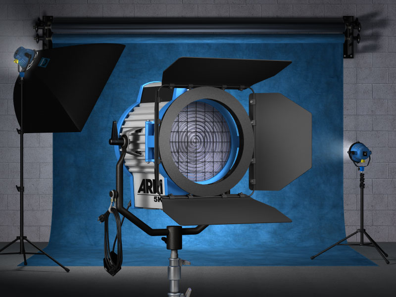
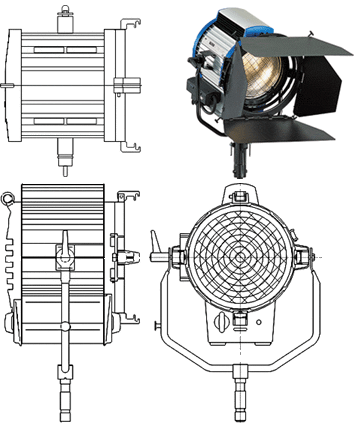 Whenever possible use reference material when creating your 3D objects. I downloaded the orthographic drawings (top, front, side), along with the perspective photo that you see to the right from the manufacturers website. Arri also included specifications for each of its lighting instruments that included gross dimensions. The orthographic drawings, photo and dimensions represent the best possible scenario your likely to find for reference material. Making sure the orthographic views are scaled in proportion to one another, bring them in as backgroungd images to the corresponding views of you modeling package, set a gross dimension and your ready to model. Unfortunately, this kind of detailed information is hard to find and you'll usually have to settle for much less. This is where your digital camera can become your best friend. Take pictures of your subject trying to emulate orthographic views and use a long lens to help minimize perspective distortion. Also, try to get one or two gross measurements if you can. If you can't measure, include a reference object in the picture (coin, cup, soda can), then when you model bring your (built to scale) reference model into your scene. Scale your background reference image to match your scaled reference model. Now whatever else you model in the scene will automatically be in scale.
Add construction details to your models.

Model construction detail into your objects. Notice the close-up of the power cord connector pictured to the right. How was it made and assembled. All manufactured objects are held together somehow. Modeling details of how your objects are constructed and held together with screws, nuts, bolts, seams etc... can greatly increase the believability of your models.

Bevel and boolean are perhaps the two most powerful tools found in most 3D applications. Click the "Devine Bevelation" button below for a step by step example of how the power cord connector was modeled.
- Posted by: Chris
- Posted on: 25/07/2013
- Comments: 17
- Categories: HTML, CSS,